










That makes good cardboard POP display design more than a matter of attractive graphics. The structure needs to work with the product, the retail environment, and the way shoppers move through the store. A strong display should make the brand visible from the right distance, keep the product easy to recognize, and make picking it up feel natural.
For brands using corrugated cardboard displays for promotions, product launches, or secondary merchandising, these details can determine whether the display becomes a useful selling tool or simply occupies floor space.
What Makes a Cardboard POP Display Effective in Retail?
A POP display is designed to give a product a stronger position than it would have on a standard shelf. In cardboard applications, this can include floor-standing displays, countertop units, side displays, dump bins, and other temporary or semi-permanent retail structures.
The material itself is only part of the solution. The real challenge is making the cardboard structure work within the retail environment. It needs to present the product clearly while remaining stable, accessible, and visually recognizable.
A well-designed cardboard POP display should answer three questions quickly: What is the product? Why should I notice it? Where do I pick it up? If shoppers need to stop and study the display before understanding these basic points, the design is already creating unnecessary friction.
How Cardboard Display Design Changes Shopper Attention
Retail shoppers rarely examine a display from top to bottom. They scan. Their attention may first be caught by a large brand element, a distinctive shape, a strong product image, or the products themselves.
This is why visual hierarchy matters. The header, graphics, shelves, and products should not all compete for attention. A useful cardboard display gives shoppers a clear starting point and then leads them toward the product.
Viewing distance also changes the design. A display positioned at the end of an aisle needs to communicate from farther away than a small countertop unit placed beside a checkout. The size of the header, amount of graphic information, product arrangement, and contrast should reflect where the display will actually be seen.
A display that looks impressive in a product photo can still disappear on a crowded retail floor. The design has to work from the shopper's actual viewing angle, not just from the front.
Make the Product Easy to Recognize and Easy to Reach
Getting attention is only the first step. Once a shopper notices the display, the product needs to remain visible.
This is particularly important for cardboard displays carrying multiple SKUs. Shelves that are too deep, excessive graphics, oversized structural elements, or products positioned too far back can make the display look busy while reducing product visibility.
Access matters just as much. A shopper should not have to reach around a large header panel or move several products to get to the item they want. Shelf height, front opening, product depth, and the amount of stock on each level should be considered during structural design.
This is where engineering becomes part of the merchandising strategy. The display is not successful simply because it can hold the required products. It needs to make those products easy to see, understand, and pick up.
Design the Cardboard Display Around the Retail Location
A cardboard POP display does not operate in isolation. Its location determines how shoppers encounter it.
An aisle-end display has a different job from a countertop display. A unit positioned beside an existing shelf may need to attract attention from the side, while a display near checkout may have only a small area in which to communicate its message.
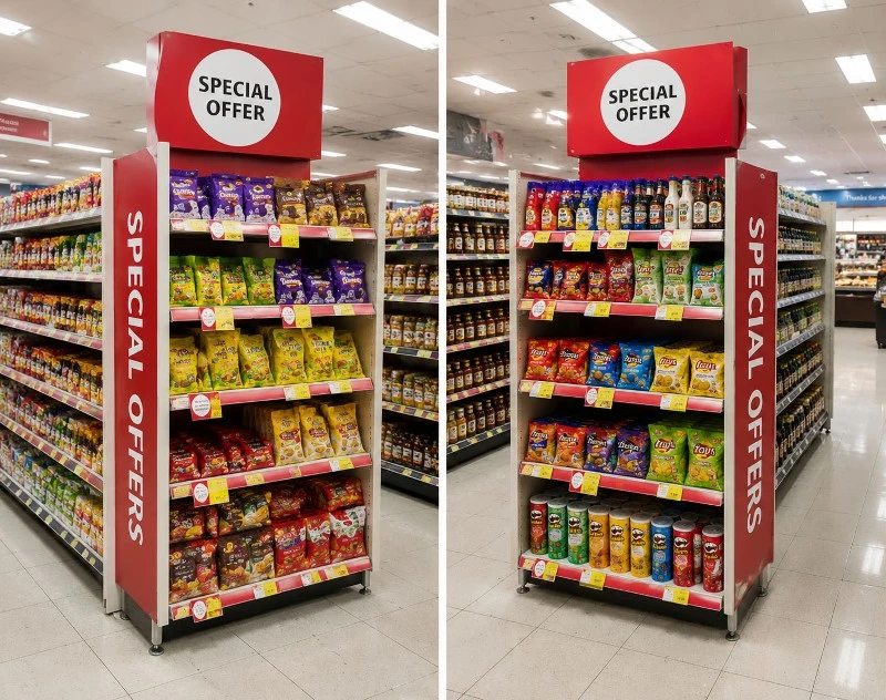
For example, a floor-standing corrugated display used in a supermarket promotional zone can use a larger header and stronger brand blocking because shoppers may see it from several meters away. A smaller display placed near a checkout needs to work at a much closer range and should make product access almost immediate.
Before designing the structure, it is worth asking where the shopper will first see it, which direction they will approach from, and what other products or fixtures will compete for their attention.
The best location cannot compensate for a poor display design, but a good design can lose much of its impact when it is placed in the wrong part of the store.
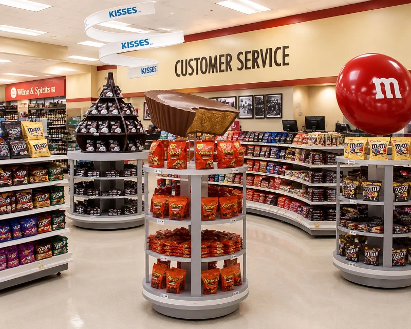
Build Visual Hierarchy Into the Cardboard Structure
Graphics and structure should be developed together rather than treated as separate tasks.
The header is often the first branded element a shopper sees, but making it larger does not automatically make it more effective. Its size should relate to viewing distance and the overall proportions of the display.
The shelves also contribute to visual hierarchy. Their height and spacing influence how easily shoppers can distinguish different products or SKUs. If every shelf carries the same amount of information and every product has equal visual weight, the display can become difficult to scan.
Side panels can also have an important role. For displays positioned beside aisles or shelves, these areas may be visible before the front of the unit. Using them only as decorative surfaces can mean losing an opportunity to communicate the brand.
In a well-developed cardboard POP display, the printed graphics and physical structure guide the shopper in the same direction.
Design for Real Stock Levels, Not Just a Full Display
One of the easiest problems to overlook is what happens after the display has been used for several days.
A fully stocked display may look balanced in a design rendering. The same display can look very different when half of the products have been sold.
This matters because cardboard displays are often used for promotional products, seasonal campaigns, and fast-moving consumer goods. Stock levels can change quickly, and store employees may not have time to reorganize the display constantly.
The structure should therefore maintain a reasonable visual balance even when inventory drops. Shelf depth, product orientation, framing, and graphic placement all influence how the display looks in partially stocked conditions.
Replenishment should also be considered. If products are difficult to refill or the structure becomes unstable during restocking, the display may gradually lose the appearance that made it effective in the first place.
Why Custom Cardboard POP Displays Can Improve Retail Performance
Standard display formats can work well when the product, retail space, and campaign requirements are straightforward. Customization becomes more useful when those conditions are less predictable.
A product may have unusual dimensions. Several SKUs may need to be displayed together. The retailer may provide a specific footprint. Or the brand may need a stronger visual presence than a standard cardboard unit can provide.
In these situations, custom engineering allows the structure to be developed around the actual product and retail environment instead of forcing the product into a predefined format.
The objective should not be to make the display more complicated. It should be to solve a specific merchandising problem-whether that means improving product visibility, increasing capacity, making replenishment easier, or creating stronger brand recognition.
Why Some Cardboard POP Displays Underperform
Not every attractive display performs well in a store.
One common problem is too much messaging. Brands may try to communicate product benefits, promotions, corporate messages, and multiple product features at the same time. The result is often a display that looks busy but communicates very little at first glance.
Another problem is poor product visibility. A large branded header or decorative structure can attract attention while hiding the products underneath it. In that situation, the display succeeds at getting noticed but fails at completing the next step.
There is also the problem of designing for the front view only. Retail shoppers do not always approach a display head-on. A cardboard display placed beside an aisle may first be seen from the side, making the side panels, product orientation, and overall silhouette important parts of the design.
Finally, the structure has to match the product category. A high-volume beverage display needs different shelf strength and replenishment considerations from a small beauty or accessory display. Good cardboard display design starts with the product and retail conditions rather than applying the same structure to every campaign.
From Cardboard Structure to Retail Performance
A successful cardboard POP display does more than create an additional place to put products. It changes how those products are encountered in the store.
The strongest designs connect several details that are easy to consider separately: viewing distance, brand visibility, product arrangement, access, structural stability, replenishment, and the location of the display.
That is why effective cardboard POP display design starts before the artwork is finalized. The structure, product requirements, graphics, and retail environment need to be considered as one system.
For brands planning a new retail campaign, the more useful question is not simply whether the cardboard display looks attractive. It is whether the display helps shoppers notice the product, understand it quickly, and reach for it without unnecessary friction.
When those elements work together, a cardboard display becomes more than a temporary fixture. It becomes part of the brand's retail strategy.