









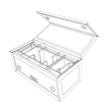



Packaging design is the process of shaping how a product looks, feels, and functions inside the container it ships and sells in.
It isn't one discipline - it's two working together. The first is structural: how a box folds, closes, stacks, and protects whatever is inside it during shipping, storage, and handling. The second is visual: the color palette, typography, imagery, and layout that let a shopper recognize a brand in a fraction of a second, without reading a single word.
Neither half works in isolation. A box engineered to survive a warehouse but designed with no visual identity is just a crate. A box with beautiful graphics but no structural integrity is a liability the moment it's stacked on a pallet. Packaging design, done properly, is the point where engineering and branding meet - and the result is what turns a plain container into custom packaging that sells the product before anyone even lifts the lid.
That's the definition in a sentence. But it doesn't explain why so many boxes on so many shelves still fail at this job, or what separates the small number that actually succeed. That's the part worth digging into.

The core problem: products are never judged in isolation
No product gets evaluated purely on its own merits. It's always seen next to something else.
Think about the actual moments a customer encounters packaging:
- Standing in front of a shelf, scanning a dozen similar boxes in under three seconds.
- Comparing a warehouse club display where five brands share the same aisle.
- Scrolling a thumbnail-sized product photo on a phone screen, next to four competitors in the same search results.
In every one of these moments, generic, off-the-shelf packaging blends straight into the background. It doesn't say "worth choosing." It says "interchangeable" - and once a shopper's brain files a product under "interchangeable," price becomes the only remaining differentiator. That's a losing position for almost any brand that isn't the cheapest option on the shelf.
This is exactly why so many companies eventually move away from stock boxes. They shift toward custom product packaging boxes - built around their own product's exact dimensions, their own shipping requirements, and their own brand story - instead of a box that, structurally and visually, could belong to absolutely anyone.
What are the elements of packaging design?
To understand why some packaging succeeds and some quietly fails, it helps to separate the discipline into its actual components. There are five that matter most:
- Structure - the physical shape, wall thickness, closure method, and construction of the box itself.
- Graphics - color palette, logo placement, imagery, and how all of it reads from a few feet away.
- Typography - the fonts and text hierarchy that guide a shopper's eye to the right information first.
- Material - the substrate itself, whether that's custom cardboard boxes, rigid setup boxes, corrugated shippers, or flexible pouches.
- Finishing - the printing technique, coatings, and tactile details like embossing, foil stamping, or spot gloss.
Here's where most brands go wrong: they optimize one of these - almost always graphics - and treat the other four as fixed constraints someone else will handle later.
That imbalance is what produces packaging that looks flawless in a design file and then fails the moment it meets the real world. A box gets crushed in transit because structure was never stress-tested. Colors print differently than they appeared on screen because material and ink weren't considered together. A design doesn't fit standard shipping equipment because dimensions were finalized before checking with the fulfillment team.
Material and print quality are a particularly common failure point. Custom printed packaging boxes need a substrate that holds ink cleanly, resists smudging, and still performs structurally - a balance that's easy to miss when the design team and the packaging engineer never actually talk to each other during development.
What makes a good packaging design?
This same imbalance shows up again at a higher level: brands tend to over-index on a single dimension of what "good" packaging even means.
A brand chasing pure aesthetics might commission gorgeous, award-worthy artwork - and ship it in a box too flimsy to protect what's inside. A brand chasing pure cost-efficiency might use bulletproof, heavy-duty cardboard with zero visual identity, and end up looking indistinguishable from a dozen competitors using the exact same generic supplier.
Good packaging design has to do three things at the same time, not just one of them:
1. Protect the product - surviving real shipping, handling, and shelf conditions without damage.
2. Communicate the brand instantly - being recognizable even with the logo out of frame, through color, shape, or texture alone.
3. Create a positive physical experience - making the moment someone opens it feel considered rather than accidental.
A design that only checks one or two of these boxes isn't actually finished - it just looks finished until it meets a real customer or a real shipping route.
What's the importance of good packaging design?
This is exactly why the imbalance above is so costly: packaging touches more of the business than most companies give it credit for.
Packaging is one of the only marketing surfaces that reaches literally every customer - whether they discover a brand on a physical shelf or through an online order arriving at their front door. And its effects are measurable in very concrete ways:
- Purchase decisions - shoppers choose between visually similar products in seconds, and packaging is often the deciding factor.
- Brand perception - consistent packaging builds recognition that carries into repeat purchases and word-of-mouth.
- Product protection - poor structural design directly drives up damage-related returns and refunds.
- Return rates - a product that arrives crushed or leaking gets sent back regardless of how good the item inside actually is.
Despite this, many companies still underinvest in packaging, mostly because its return on investment feels harder to measure than a paid ad campaign with a clean click-through rate. That underinvestment shows up as a slow, often invisible erosion of brand equity: products returned more often due to shipping damage, customers who don't recognize the brand at the moment of reorder, and the organic social sharing that comes from a genuinely great unboxing moment - the kind that never happens, because there was nothing memorable enough to photograph or post.
How do you design packaging?
Once it's clear where and why packaging typically fails, the fix comes down to sequencing - doing things in the right order, rather than skipping ahead to the fun part.
Effective packaging design moves through five deliberate stages:
1. Define requirements first. Lock in the product's exact dimensions, weight, fragility, and any regulatory or shipping constraints before anything else is decided.
2. Establish brand identity. Set the color palette, logo usage, and messaging hierarchy that the structure will need to accommodate.
3. Prototype the structure. Build a physical, working sample using the intended material - this is where custom cardboard boxes for shipping or rigid boxes for retail display actually get tested, not just imagined.
4. Test under real conditions. Run drop tests, compression tests, and humidity or temperature exposure before committing to a full print run.
5. Finalize graphics and print specs. Only once the structure is validated should final artwork, exact color matching, and finishing techniques get locked in.
Skipping steps in this order is the single most common cause of packaging failure. Brands that finalize graphics before locking structural requirements almost always end up redesigning artwork later, once the box shape inevitably has to change. Brands that skip physical testing entirely tend to discover shipping damage only after customer complaints start rolling in - which is a far more expensive way to find out.
Following this order protects both the budget and the brand at the same time, since reprinting artwork is dramatically cheaper than re-tooling a structural die after production has already started.
What are the notable trends in packaging design?
The same problem-solving mindset applies to staying current, not just to getting the fundamentals right.
Consumer expectations have shifted faster than many legacy packaging strategies can keep pace with. A few shifts stand out:
- Sustainability. Shoppers increasingly associate excessive or non-recyclable packaging with poor brand values, and actively factor that into purchase decisions.
- Minimalism with bold branding. Clean layouts paired with confident, distinctive color choices are replacing cluttered, feature-heavy label designs.
- Smart packaging. QR codes and NFC tags are turning static boxes into a gateway for product authentication, storytelling, or loyalty programs.
- Personalization at scale. Shoppers now expect the kind of individualized experience once reserved for premium or artisanal products - even from mass-market brands.
Rather than chasing every trend simultaneously, the practical solution is to adopt the ones that align with both consumer values and operational reality. Recyclable, reduced-material structures address sustainability concerns without sacrificing protection. Clean, confident graphic design communicates quality even on genuinely minimal packaging. And advances in short-run digital printing now make personalised packaging boxes viable even for smaller brands, since true customization no longer requires the massive print volumes it once did to be cost-effective.
Taken together, the path forward is straightforward, even if it takes discipline to follow: understand what packaging design actually is, recognize where and why most brands get it wrong, and apply a structured process - from requirements, to structure, to testing, to trend-adoption - that turns a box into a genuine sales asset instead of a missed opportunity.