






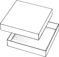
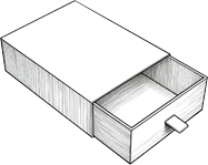



A display box has two jobs at the same time: it needs to present the product clearly and make people want to look at it. A box can use bright colors and bold graphics yet still look crowded or inexpensive. On the other hand, a clean design may look professional but fail to attract attention in a busy retail environment.
The most effective display boxes for products find the balance between visual impact and visual order. Color, typography, product visibility, graphics, structure, and finishing details should support one another rather than compete for attention.
Whether you are developing packaging for food, cosmetics, electronics, accessories, toys, or promotional products, these practical design tips can help create a display box that catches attention while maintaining a polished and professional appearance.
1. Start With One Strong Visual Idea
An eye-catching display box does not need to contain more design elements. It needs to make the right element noticeable first.
Before working on colors, images, or decorative graphics, decide what customers should see first. This could be the product itself, the brand name, a distinctive product image, or one important selling point.
Create a Clear Focal Point
A useful visual hierarchy is:
Brand → Product → Main Message → Supporting Information
For example, a food display box might lead with an appetizing product image, followed by the brand and flavor. A cosmetic product may place greater emphasis on the product itself and a short benefit statement.
The focal point should match the reason customers are likely to notice the product. If everything is designed to attract attention equally, nothing actually becomes the focus.
Avoid Competing Visual Elements
A common mistake is treating every surface as an opportunity for promotion. Large logos, product photographs, slogans, icons, patterns, discount messages, and multiple claims can quickly compete with each other.
A stronger approach is to decide which element deserves the most visual weight and reduce the prominence of everything else.
Practical tip: Print a draft of the artwork at approximately the size of the finished box and look at it from a few feet away. If you cannot identify the main message quickly, simplify the layout.

2. Choose Colors That Attract Attention Without Looking Cheap
Color is usually one of the first things shoppers notice, but using more color does not automatically make a display box more attractive.
Use Brand Colors as the Foundation
The color palette should reinforce brand recognition rather than simply follow current design trends. A consistent palette also makes different products within the same product line feel connected.
A strong design may use one dominant color, one or two supporting colors, and neutral space. The exact combination depends on the brand and product category.
Use Contrast to Create Attention
Contrast can make important elements easier to notice. A dark product against a lighter background, a bright accent against a neutral surface, or strong text against a simple background can create visual separation without making the entire box loud.
This is particularly useful for custom printed display boxes, where color and graphics are part of the physical merchandising experience.
Avoid Too Many Colors
An overly colorful box can lose its visual hierarchy. If every section has a different background or accent color, the shopper may not know where to look.
The goal is not maximum color. It is controlled contrast.
3. Make the Product the Star of the Display Box
The packaging should attract attention, but it should not become more important than the product inside.
This is one of the fundamental differences between ordinary packaging and display boxes for products.
Use Product Images Strategically
A large product image can work well when the physical product is hidden or needs additional explanation. However, if the actual product has strong visual appeal, covering it with a large printed image may be unnecessary.
Consider whether customers need to see:
the actual product
its color or finish
its shape
its size
its packaging
a particular feature
The answer should influence the display structure.
Use Windows and Cutouts to Reveal the Product
Windows and cutouts can make the product part of the visual design. Instead of asking customers to imagine what is inside, the packaging gives them a direct view.
The opening should be positioned intentionally. A poorly positioned window may show a less attractive side of the product or hide an important feature.
Avoid Covering Too Much of the Product
When several products are displayed together, their arrangement becomes part of the design. Products should remain recognizable from the normal viewing angle, especially when different SKUs need to be compared.
The strongest display box often works because the physical product and printed graphics form one visual composition.
4. Create a Clean and Balanced Layout
If color creates attention, layout determines whether that attention feels professional.
A polished display box usually has a clear relationship between images, text, logos, margins, and empty space.
Give Important Elements Enough Space
Crowding every available area with information can make a display box feel cheaper and harder to understand.
Give the main product image room to breathe. Allow enough space around the logo and important text so they remain distinct from surrounding elements.
Use Alignment to Create Order
Consistent alignment creates a sense of structure even when the design contains several elements.
For example, product names, benefit statements, and supporting information can follow a common alignment rather than being positioned independently.
Small spacing and alignment decisions can have a surprisingly large effect on the perceived quality of the finished box.
Let Empty Space Work for the Design
Empty space is not wasted space.
It can create contrast around the product, separate different messages, and make a design feel more refined. Premium packaging often relies on restraint rather than decoration.
A useful question during design review is:
> Does this element improve communication, or is it here simply because there is empty space?
If it does not add meaning, consider removing it.
5. Keep Typography Simple and Easy to Read
Typography can make a display box look either polished or chaotic.
Limit the Number of Fonts
Using too many typefaces can make the packaging appear inconsistent. A small number of complementary fonts is usually easier to control.
More important than choosing a fashionable font is making sure the text fits the brand and remains readable at the intended viewing distance.
Create a Clear Text Hierarchy
Not every piece of information should have the same size or weight.
A practical hierarchy could be:
Product Name → Key Benefit → Supporting Information
The product name should be easy to identify. Secondary information can be smaller, while detailed specifications should not compete with the primary message.
Design for Real Viewing Distance
A design that looks excellent on a computer monitor may become difficult to read once the box is placed on a shelf.
Review the artwork at its actual size and consider how quickly a shopper can identify the brand, product, and main benefit.

6. Use Images and Graphics With a Purpose
Graphics can make packaging more distinctive, but decorative elements should have a reason for being there.
Choose One Dominant Image
A strong hero image is often more effective than several competing photographs.
For food products, this may be a product serving suggestion. For beauty products, it could be the product itself or a carefully selected lifestyle image. For electronics, clean product photography may communicate the design better than decorative illustrations.
Match Graphics to the Product Category
The visual language should make sense for the product.
Food packaging may benefit from appetizing imagery and strong product cues. Beauty packaging often works better with controlled layouts and refined imagery. Children's products can support more playful graphics, while technology products may benefit from a cleaner and more structured approach.
Avoid Decorative Graphics That Add No Meaning
Patterns, illustrations, and icons should reinforce the product story or brand personality.
Adding graphics simply because the box feels empty can weaken the overall design.
A useful principle is:
> Decoration should support the product story, not compete with it.
7. Use Shape and Structure to Create Visual Interest
Visual appeal does not have to come entirely from printing.
The physical form of the display box can become part of the design.
Experiment With Distinctive Silhouettes
Depending on the product, designers can explore:
curved tops
angled panels
product-shaped outlines
stepped structures
layered fronts
A distinctive silhouette can help a display stand out from standard rectangular packaging.
Use the Box Opening as Part of the Design
A window, cutout, or open front can serve both a functional and visual purpose.
Instead of treating the opening as something added after the artwork is finished, incorporate it into the composition from the beginning.
The opening can frame the product, create visual depth, or direct attention toward a particular feature.
Keep Creativity Practical
Creative does not mean complicated.
If an unusual structure makes the product difficult to access, creates unnecessary visual clutter, or interferes with the printed artwork, it may not improve the final result.
The best custom display box designs usually have a clear reason behind their unusual features.
8. Make Branding Visible Without Overbranding
Branding needs to be recognizable, but repeating the logo across every available surface is rarely the best solution.
Make the Logo Easy to Recognize
Place the logo where customers naturally look rather than simply making it as large as possible.
The strongest position depends on the box structure and viewing angle.
Use Brand Elements Consistently
Colors, typography, imagery, patterns, and graphic style should work together to create a recognizable brand language.
This becomes especially important when several custom product display boxes are developed for different products within the same product range.
Avoid Repeating the Logo Everywhere
A strong brand does not need to shout from every surface.
If the color palette, typography, product photography, and overall design already communicate the brand, excessive logo repetition can make the package feel less refined.
9. Add a Premium Feel Through Finishing Details
Finishing techniques can improve the perceived quality of a display box, but they should support the design rather than compensate for a weak concept.
Depending on the packaging material and desired appearance, options may include:
matte finishing
gloss finishing
spot UV
foil stamping
embossing
debossing
textured effects
The key is knowing where to use them.
For example, a restrained foil treatment on a logo may create a refined focal point on a minimalist design. Applying several finishing effects to an already busy package may produce the opposite result.
In other words:
Premium does not mean adding every available finishing technique.
It means choosing details that reinforce the intended visual character.
10. Design for the Product Category
There is no universal visual formula for every display box.
Food and Beverage
Food products often benefit from strong product imagery, appetite appeal, clear flavor identification, and colors that communicate the product character.
Cosmetics and Beauty Products
A more controlled layout, restrained color palette, high-quality imagery, and carefully selected finishing details can create a refined appearance.
Electronics and Accessories
Clean graphics, organized information, product photography, and a modern visual language can work better than excessive decoration.
Toys and Children's Products
Playful colors, illustrations, characters, and visual interaction can be effective when they match the intended age group and brand personality.
The important point is to design around the expectations of the category rather than applying the same visual style to every product.
Frequently Asked Questions
1.What makes a display box eye-catching?
An eye-catching display box usually has a clear focal point, strong visual contrast, recognizable branding, and an easy-to-understand product presentation. The objective is to attract attention quickly without creating visual clutter.
2.How can I make a display box look more professional?
Focus on visual hierarchy, consistent typography, controlled colors, sufficient white space, balanced proportions, and high-quality product imagery. Appropriate finishing details can further enhance the design when used selectively.
3.What colors are best for display box design?
There is no single best color. The choice should reflect the brand, product category, target audience, and surrounding retail environment. Contrast and consistency are generally more important than choosing a particular color.
4.How can I make a display box look premium?
A premium appearance usually comes from restraint. Clean layouts, carefully selected typography, quality imagery, consistent branding, sufficient white space, and purposeful finishing details can create a more sophisticated result than excessive decoration.
5.Should a display box show the product?
If the product has strong visual appeal or customers need to inspect it before purchase, showing it can be highly effective. Windows, cutouts, and open-front structures can improve visibility while maintaining the intended presentation.
6.Can a display box be customized for my product?
Yes. Custom display boxes can be developed around specific product dimensions, branding requirements, product visibility, SKU arrangements, openings, and intended display environments. The visual design and physical structure can be developed together.
Conclusion
Designing an effective display box is not about making the packaging as colorful or complicated as possible. The strongest designs know what to emphasize and what to leave out.
Start with one strong visual idea. Use color to attract attention without overwhelming the viewer. Make the product the visual focus, create a clean layout, keep typography readable, and use graphics with a clear purpose. Shape, openings, branding, and finishing details can then add character without taking attention away from the product.
Most importantly, an attractive display box should still feel appropriate for its product category and brand. A playful design may work for children's products but feel out of place for premium cosmetics. A minimalist layout may suit electronics but lack the energy required for certain food products.
The goal is simple: make people notice the box, understand the product, and remember the brand.
For brands developing custom product display boxes, combining visual design with practical packaging expertise can make the difference between a box that simply holds a product and one that actively contributes to product presentation.